Look and feel
Before domain logic: make the app yours. ShowPony ships with its own lavender/violet brand. It is not the warm neutral Kumiko renderer default (IBM Plex Sans, light surfaces) you see in a bare scaffold, and not the neon Vice City palette from the kumiko.rocks hero demo. Two small files control all of it.
Brand colours
Section titled “Brand colours”Import the renderer stylesheet, then override design tokens in @theme and
on :root:not(.dark) / .dark so light and dark both carry your palette:
@theme {  --color-primary: #7c3aed;  --color-primary-foreground: #ffffff;  --color-background: #f8f6ff;  --color-ring: #8b5cf6;}
@layer base { :root:not(.dark) { --color-primary: #7c3aed; --color-background: #f8f6ff; /* …sidebar, border, muted: full surface, not just buttons */ }}src/styles.css.
Override background, card, border, and sidebar tokens, not just
--color-primary. Otherwise the admin shell still reads as generic Kumiko
chrome with a tinted button. Tailwind v4 picks the tokens up everywhere.
The shell also exposes a theme toggle (light/dark); no extra wiring.
ShowPony predates defineAppTheme, so its stylesheet still sets the tokens by
hand. A new app declares its colours once with defineAppTheme in a theme.ts
and loads it with @plugin "./theme.ts". The plugin writes light and dark
values that beat the renderer palette, so no @layer base block is needed.
Make it yours shows the setup.

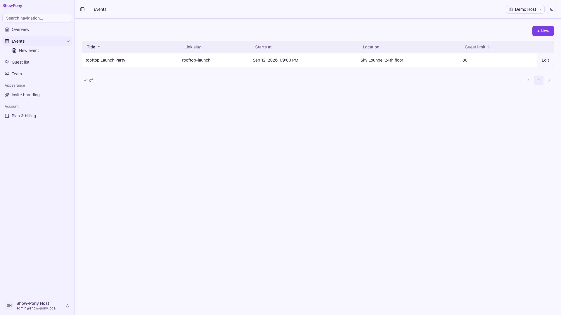
The public RSVP page shares the same stylesheet. The guest HTML adds
class="show-pony-public" on <body> for a slightly warmer invite canvas
while keeping the same violet CTAs.
Copy and labels
Section titled “Copy and labels”Every nav item, section title, and field label is an i18n key, not a string in the feature:
"showpony:nav.events": { de: "Events", en: "Events" },"showpony:section.event-basics": { de: "Eckdaten", en: "Basics" },"showpony:entity:event:field:title": { de: "Titel", en: "Title" },src/features/show-pony/i18n/keys.ts.
Wire translations in showPonyClient (src/features/show-pony/web/index.ts). A new locale is another
block in keys.ts. The schema-driven screens in
chapter 8 pick them up automatically.
What you have now
Section titled “What you have now”- Lavender surfaces + violet primary on light (deep violet chrome on dark)
- de + en strings for nav, host forms, and the public invite page
- Per-tenant invite branding (hero image, accent, layout preset)
- A dashboard that reads as ShowPony, not the Kumiko platform default
Next: mount auth, tenant, and user: chapter 3.
The complete files
Section titled “The complete files”/* show-pony Theme — lavender/violet event-app identity. Deliberately NOT the neutral Kumiko renderer chrome (gray/white) nor the kumiko.rocks Vice City hero palette. Admin + public share this file; the guest page adds `.show-pony-public` on <body> for a slightly warmer invite surface. */
@import "@cosmicdrift/kumiko-renderer-web/styles.css";
@source "./**/*.{ts,tsx}";
@theme { /* Dark — deep violet chrome (not renderer neutral gray). */ --color-background: #140a24; --color-foreground: #f5f0ff; --color-card: #1f1235; --color-card-foreground: #f5f0ff; --color-popover: #1f1235; --color-popover-foreground: #f5f0ff; --color-border: #3d2a5c; --color-input: #3d2a5c; --color-muted: #261740; --color-muted-foreground: #c4b5fd; --color-secondary: #261740; --color-secondary-foreground: #f5f0ff; --color-accent: #372460; --color-accent-foreground: #f5f0ff; --color-destructive: #f87171; --color-destructive-foreground: #ffffff; --color-primary: #a78bfa; --color-primary-foreground: #140a24; --color-ring: #8b5cf6; --color-foreground-secondary: #d8ccff; --color-foreground-disabled: #7a6a9a; --color-border-strong: #5b4785; --color-border-row: #2d1b4e; --color-status-neutral: #c4b5fd; --color-status-neutral-surface: #261740;
--color-sidebar: #1a1030; --color-sidebar-foreground: #e9e0ff; --color-sidebar-primary: #a78bfa; --color-sidebar-primary-foreground: #140a24; --color-sidebar-accent: #2d1b4e; --color-sidebar-accent-foreground: #f5f0ff; --color-sidebar-border: #3d2a5c; --color-sidebar-ring: #8b5cf6; --color-sidebar-muted: #b5a6e0; --color-sidebar-input: #261740;}
/* Renderer-Web wins on :root:not(.dark) / .dark specificity — match its layer. */@layer base { :root:not(.dark) { --color-background: #f8f6ff; --color-foreground: #1e1033; --color-card: #ffffff; --color-card-foreground: #1e1033; --color-popover: #ffffff; --color-popover-foreground: #1e1033; --color-border: #ddd6fe; --color-input: #ddd6fe; --color-muted: #f0edfa; --color-muted-foreground: #6b5b8a; --color-secondary: #ede9fe; --color-secondary-foreground: #1e1033; --color-accent: #ede9fe; --color-accent-foreground: #1e1033; --color-destructive: #dc2626; --color-destructive-foreground: #ffffff; --color-primary: #7c3aed; --color-primary-foreground: #ffffff; --color-ring: #8b5cf6; --color-foreground-secondary: #4c3d6b; --color-foreground-disabled: #9d8fbf; --color-border-strong: #c4b5fd; --color-border-row: #ede9fe; --color-status-neutral: #4c3d6b; --color-status-neutral-surface: #f0edfa;
--color-sidebar: #f3f0ff; --color-sidebar-foreground: #4c3d6b; --color-sidebar-primary: #7c3aed; --color-sidebar-primary-foreground: #ffffff; --color-sidebar-accent: #ede9fe; --color-sidebar-accent-foreground: #1e1033; --color-sidebar-border: #ddd6fe; --color-sidebar-ring: #8b5cf6; --color-sidebar-muted: #6b5b8a; --color-sidebar-input: #ffffff; }
.dark { --color-background: #140a24; --color-foreground: #f5f0ff; --color-card: #1f1235; --color-card-foreground: #f5f0ff; --color-popover: #1f1235; --color-popover-foreground: #f5f0ff; --color-border: #3d2a5c; --color-input: #3d2a5c; --color-muted: #261740; --color-muted-foreground: #c4b5fd; --color-secondary: #261740; --color-secondary-foreground: #f5f0ff; --color-accent: #372460; --color-accent-foreground: #f5f0ff; --color-destructive: #f87171; --color-destructive-foreground: #ffffff; --color-primary: #a78bfa; --color-primary-foreground: #140a24; --color-ring: #8b5cf6; --color-foreground-secondary: #d8ccff; --color-foreground-disabled: #7a6a9a; --color-border-strong: #5b4785; --color-border-row: #2d1b4e; --color-status-neutral: #c4b5fd; --color-status-neutral-surface: #261740;
--color-sidebar: #1a1030; --color-sidebar-foreground: #e9e0ff; --color-sidebar-primary: #a78bfa; --color-sidebar-primary-foreground: #140a24; --color-sidebar-accent: #2d1b4e; --color-sidebar-accent-foreground: #f5f0ff; --color-sidebar-border: #3d2a5c; --color-sidebar-ring: #8b5cf6; --color-sidebar-muted: #b5a6e0; --color-sidebar-input: #261740; }
/* Guest invite page — warmer lavender canvas, same violet CTAs. */ :root:not(.dark) body.show-pony-public { --color-background: #faf8ff; --color-muted: #f3effc; --color-border: #e4dcff; }
.dark body.show-pony-public { --color-background: #120820; --color-card: #1c1030; }
body.show-pony-public, .show-pony-public.min-h-screen { background-color: var(--color-background); background-image: radial-gradient( ellipse 90% 55% at 50% -8%, color-mix(in srgb, var(--color-primary) 16%, transparent), transparent 70% ), radial-gradient( ellipse 45% 35% at 100% 20%, color-mix(in srgb, var(--color-primary) 10%, transparent), transparent 65% ), radial-gradient( ellipse 40% 30% at 0% 80%, color-mix(in srgb, var(--color-primary) 8%, transparent), transparent 60% ); }}
/* Public invite polish — CSS-only motion; respects prefers-reduced-motion. */@layer components { @keyframes sp-hero-zoom { from { transform: scale(1.1); } to { transform: scale(1.16); } }
@keyframes sp-check-pop { 0% { opacity: 0; transform: scale(0.6); } 70% { transform: scale(1.08); } 100% { opacity: 1; transform: scale(1); } }
.show-pony-public .sp-hero-immersive { box-shadow: 0 12px 20px -6px color-mix(in srgb, var(--color-foreground) 11%, transparent); min-height: 360px; }
/* Text sits directly on the hero photo (no scrim behind the heading) — a shadow keeps it legible against light photos regardless of tint. */ .show-pony-public .sp-hero-immersive :is(h1, p, span) { text-shadow: 0 1px 3px rgba(0, 0, 0, 0.45); }
@media (min-width: 640px) { .show-pony-public .sp-hero-immersive { min-height: 420px; } }
.show-pony-public .sp-hero-split { position: relative; z-index: 1; overflow: hidden; box-shadow: 0 12px 20px -6px color-mix(in srgb, var(--color-foreground) 11%, transparent); }
.show-pony-public .sp-hero-split-row { display: flex; flex-direction: column; min-height: 280px; }
.show-pony-public .sp-hero-split-copy { flex: 1 1 50%; background: linear-gradient( 145deg, var(--color-card) 0%, color-mix(in srgb, var(--color-primary) 7%, var(--color-card)) 55%, color-mix(in srgb, var(--color-primary) 5%, var(--color-muted)) 100% ); }
.show-pony-public .sp-hero-split-media { position: relative; flex: 1 1 50%; min-height: 280px; }
@media (min-width: 1024px) { .show-pony-public .sp-hero-split-row { flex-direction: row; min-height: 380px; }
.show-pony-public .sp-hero-split-media { min-height: 380px; } }
.show-pony-public .sp-hero-media { overflow: hidden; }
.show-pony-public .sp-hero-focus-bottom { object-position: center 88%; }
.show-pony-public .sp-hero-focus-bottom.sp-hero-ken-burns { transform-origin: 50% 50%; }
.show-pony-public .sp-hero-focus-right { object-position: 72% center; }
.show-pony-public .sp-hero-focus-right.sp-hero-ken-burns { transform-origin: 72% 50%; }
.show-pony-public .sp-hero-ken-burns { min-width: 100%; min-height: 100%; transform: scale(1.1); animation: sp-hero-zoom 22s ease-out forwards; will-change: transform; }
.show-pony-public .sp-hero-grain::after { content: ""; position: absolute; inset: 0; pointer-events: none; opacity: 0.14; mix-blend-mode: soft-light; background-image: url("data:image/svg+xml,%3Csvg viewBox='0 0 200 200' xmlns='http://www.w3.org/2000/svg'%3E%3Cfilter id='n'%3E%3CfeTurbulence type='fractalNoise' baseFrequency='0.85' numOctaves='4' stitchTiles='stitch'/%3E%3C/filter%3E%3Crect width='100%25' height='100%25' filter='url(%23n)'/%3E%3C/svg%3E"); }
.show-pony-public .sp-rsvp-success { box-shadow: 0 1px 3px color-mix(in srgb, var(--color-primary) 10%, transparent); }
.show-pony-public .sp-invite-card { transition: box-shadow 0.2s ease, border-color 0.2s ease; }
.show-pony-public .sp-invite-card:hover { box-shadow: 0 8px 28px color-mix(in srgb, var(--color-primary) 12%, transparent); }
.show-pony-public .sp-rsvp-check { animation: sp-check-pop 0.45s ease-out; }
@media (prefers-reduced-motion: reduce) { .show-pony-public .sp-hero-ken-burns { animation: none; transform: scale(1.1); }
.show-pony-public .sp-rsvp-check { animation: none; }
.show-pony-public .sp-invite-card { transition: none; } }}
/* Split invite canvas — unlayered fallback when inline styles are stripped. */body.show-pony-public.sp-invite-split-page,.show-pony-public.min-h-screen.sp-invite-split-page { background-color: color-mix(in srgb, var(--color-primary) 10%, var(--color-background)); background-image: radial-gradient( ellipse 90% 60% at 0% 0%, color-mix(in srgb, var(--color-primary) 38%, transparent), transparent 55% ), radial-gradient( ellipse 75% 55% at 100% 100%, color-mix(in srgb, var(--color-primary) 28%, transparent), transparent 50% ), linear-gradient( 180deg, color-mix(in srgb, var(--color-primary) 18%, var(--color-background)) 0%, color-mix(in srgb, var(--color-primary) 10%, var(--color-background)) 50%, var(--color-background) 95% );}// show-pony i18n keys. Convention: feature prefix `showpony:`// + `entity:<e>:field:<name>` for field labels (columns + form),// `screen:<id>.title` for page titles, `showpony:nav.<id>` for// sidebar labels, `:option:<value>` for select values.
type LocaleEntry = { de: string; en: string };
export const showPonyTranslations = { "showpony:nav.events": { de: "Events", en: "Events" }, "showpony:nav.event-new": { de: "Neues Event", en: "New event" }, "showpony:nav.guests": { de: "Gästeliste", en: "Guest list" }, "showpony:nav.appearance": { de: "Erscheinungsbild", en: "Appearance" }, "showpony:nav.invite-branding": { de: "Invite-Branding", en: "Invite branding" }, "showpony:nav.account": { de: "Konto", en: "Account" }, "showpony:nav.billing": { de: "Tarif & Abrechnung", en: "Plan & billing" },
"screen:event-list.title": { de: "Events", en: "Events" }, "screen:event-edit.title": { de: "Event bearbeiten", en: "Edit event" }, "screen:rsvp-list.title": { de: "Gästeliste", en: "Guest list" }, "screen:invite-branding-settings.title": { de: "Invite-Branding", en: "Invite branding", }, "screen:billing.title": { de: "Tarif & Abrechnung", en: "Plan & billing" },
"showpony:branding.section.identity": { de: "Marke", en: "Brand" }, "showpony:branding.section.hero": { de: "Hero-Bild", en: "Hero image" },
"showpony:entity:__config-edit__:field:title": { de: "Markenname", en: "Brand name" }, "showpony:entity:__config-edit__:field:description": { de: "Tagline / Beschreibung", en: "Tagline / description", }, "showpony:entity:__config-edit__:field:accentColor": { de: "Akzentfarbe", en: "Accent color", }, "showpony:entity:__config-edit__:field:logoUrl": { de: "Logo-URL", en: "Logo URL" }, "showpony:entity:__config-edit__:field:heroImageUrl": { de: "Hero-Bild-URL", en: "Hero image URL", }, "showpony:entity:__config-edit__:field:heroStyle": { de: "Hero-Layout", en: "Hero layout" }, "showpony:entity:__config-edit__:field:heroStyle:option:immersive": { de: "Immersiv (Vollbild)", en: "Immersive (full bleed)", }, "showpony:entity:__config-edit__:field:heroStyle:option:split": { de: "Geteilt (Text + Bild)", en: "Split (text + image)", },
"showpony:section.event-basics": { de: "Eckdaten", en: "Basics" }, "showpony:section.event-details": { de: "Beschreibung", en: "Description" },
"showpony:entity:event:field:title": { de: "Titel", en: "Title" }, "showpony:entity:event:field:slug": { de: "Link-Kürzel", en: "Link slug" }, "showpony:entity:event:field:startsAt": { de: "Beginn", en: "Starts at" }, "showpony:entity:event:field:location": { de: "Ort", en: "Location" }, "showpony:entity:event:field:description": { de: "Beschreibung", en: "Description" }, "showpony:entity:event:field:guestLimit": { de: "Gäste-Limit", en: "Guest limit" },
"showpony:entity:rsvp:field:name": { de: "Name", en: "Name" }, "showpony:entity:rsvp:field:email": { de: "E-Mail", en: "Email" }, "showpony:entity:rsvp:field:status": { de: "Status", en: "Status" }, "showpony:entity:rsvp:field:plusN": { de: "Begleitung", en: "Plus guests" }, "showpony:entity:rsvp:field:eventId": { de: "Event", en: "Event" }, "showpony:entity:rsvp:field:note": { de: "Notiz", en: "Note" },
"showpony:entity:rsvp:field:status:option:yes": { de: "Zusage", en: "Going" }, "showpony:entity:rsvp:field:status:option:no": { de: "Absage", en: "Not going" }, "showpony:entity:rsvp:field:status:option:maybe": { de: "Vielleicht", en: "Maybe" },
"showpony:public.event.missing": { de: "Dieses Event gibt es nicht.", en: "This event doesn't exist.", }, "showpony:public.event.invited": { de: "Du bist eingeladen", en: "You're invited" }, "showpony:public.event.guest-limit": { de: "Bis zu {limit} Gäste", en: "Up to {limit} guests", }, "showpony:public.event.add-to-calendar": { de: "📅 Zum Kalender hinzufügen", en: "📅 Add to calendar", }, "showpony:public.rsvp.thanks": { de: "Danke, {name}!", en: "Thanks, {name}!" }, "showpony:public.rsvp.heading": { de: "RSVP", en: "RSVP" }, "showpony:public.rsvp.subheading": { de: "Kein Account nötig — Name reicht.", en: "No account needed — just your name.", }, "showpony:public.rsvp.on-list": { de: "Du stehst auf der Liste.", en: "You're on the list." }, "showpony:public.rsvp.plus-guests": { de: "Begleitung?", en: "Bringing anyone?" }, "showpony:public.rsvp.name": { de: "Name", en: "Name" }, "showpony:public.rsvp.name-placeholder": { de: "Dein Name", en: "Your name" }, "showpony:public.rsvp.email": { de: "E-Mail (optional)", en: "Email (optional)" }, "showpony:public.rsvp.email-placeholder": { de: "E-Mail (optional, für die Bestätigung)", en: "Email (optional, for your confirmation)", }, "showpony:public.rsvp.status.yes": { de: "Ich komme", en: "I'm in" }, "showpony:public.rsvp.status.maybe": { de: "Vielleicht", en: "Maybe" }, "showpony:public.rsvp.status.no": { de: "Kann leider nicht", en: "Can't make it" }, "showpony:public.rsvp.submit": { de: "RSVP senden", en: "Send RSVP" }, "showpony:public.rsvp.error": { de: "Etwas ist schiefgelaufen ({reason}). Bitte nochmal versuchen.", en: "Something went wrong ({reason}). Try again.", },
"showpony:demo.login.title": { de: "Live-Demo", en: "Live demo" }, "showpony:demo.login.body": { de: "Melde dich an, um Dashboard und Plattform-Workspace zu erkunden:", en: "Sign in to explore the host dashboard and platform workspace:", }, "showpony:demo.login.read-only": { de: "Nur ansehen — Änderungen werden auf dieser Instanz nicht gespeichert.", en: "Browse only — changes are not saved on this instance.", }, "showpony:demo.banner": { de: "Live-Demo (read-only). Zum Bauen lokal klonen —", en: "Live demo (read-only). Clone locally to build your own —", }, "showpony:demo.banner.link": { de: "Tutorial", en: "tutorial" }, "showpony:demo.public.title": { de: "Live-Demo", en: "Live demo" }, "showpony:demo.public.body": { de: "RSVPs funktionieren nur in der lokalen Installation. Hier kannst du die Invite-Seite ansehen.", en: "RSVPs work in the local install only. Here you can browse the invite page.", }, "showpony:demo.public.host-link": { de: "Host-Login", en: "Host login" }, "showpony:demo.public.tutorial-link": { de: "Tutorial", en: "Tutorial" },
"showpony:caps.usageTitle": { de: "Verbrauch", en: "Usage" }, "showpony:caps.events": { de: "Events", en: "Events" }, "showpony:caps.guests": { de: "RSVPs", en: "RSVPs" }, "showpony:caps.unlimited": { de: "(unbegrenzt)", en: "(unlimited)" }, "showpony:caps.upgradeHint": { de: "Limit erreicht, wähle oben einen größeren Tarif.", en: "Limit reached, pick a larger plan above.", },
"showpony:billing.tier.free": { de: "Free", en: "Free" }, "showpony:billing.tier.starter": { de: "Starter", en: "Starter" }, "showpony:billing.tier.pro": { de: "Pro", en: "Pro" }, "showpony:billing.tier.studio": { de: "Studio", en: "Studio" }, "showpony:billing.benefit.events": { de: "{count} Events", en: "{count} events" }, "showpony:billing.benefit.eventsUnlimited": { de: "Unbegrenzte Events", en: "Unlimited events", }, "showpony:billing.benefit.guests": { de: "{count} RSVPs gesamt", en: "{count} total RSVPs" }, "showpony:billing.benefit.guestsUnlimited": { de: "Unbegrenzte RSVPs", en: "Unlimited RSVPs", },
"showpony:errors.eventLimitReached": { de: "Event-Limit erreicht — Tarif upgraden.", en: "Event limit reached — upgrade your plan.", }, "showpony:errors.guestLimitReached": { de: "Die Gästeliste ist voll.", en: "The guest list is full.", }, // Delivery-log label for the qualified type `showpony:notify:rsvp-confirmation`. "showpony.notification.rsvp-confirmation": { de: "Antwortbestätigung", en: "RSVP confirmation", },} as const satisfies Record<string, LocaleEntry>;📄 On GitHub: src/styles.css · src/features/show-pony/i18n/keys.ts