UI widgets
Kumiko apps don’t build their own cards, badges or charts. The renderer ships a
mid-level widget kit that sits between the raw primitives (usePrimitives())
and full declarative screens, everything token-based, theme-aware and covered
by the styleguide e2e suite. App repos enforce this with the kumiko-guard-ui
CI guards: hand-rolled *Card/*Table/*Badge components, raw palette
classes, inline styles and hardcoded UI strings fail the build.
Prerequisites
Section titled “Prerequisites”- Your app renders through
@cosmicdrift/kumiko-renderer-web(any app scaffolded bykumiko createdoes). - You’ve read Features and composition so
r.screenand the feature body are familiar.
The code
Section titled “The code”Import everything from @cosmicdrift/kumiko-renderer-web:
import { StatCard, MiniStat, Sparkline, // KPIs SectionCard, CollapsibleSection, // sections StatusBadge, // status pills (tone: ok|warn|bad|critical|muted) TimeseriesChart, StatusBarChart, // SVG charts, no chart dependency QueryTable, // query-backed table with loading/error/empty DetailList, ProgressBar, ModeSwitch, // key-value list, bar, segmented control Drawer, // slide-in panel (side: left|right|top|bottom) InfinityList, // cursor-paginated scroll list, loads on IntersectionObserver ResizablePanelGroup, ResizablePanel, ResizableHandle, // draggable split (list | reading pane) EmptyState, LoadingState, ErrorState, // states useDraft, // form state: draft + patch + field(name) NumberField, MoneyField, PercentField, // number fields (unit lives in the label) SelectField, DateField, TextField, // select / date / text BooleanField, TextareaField, RangeField, FileField, AiTextField, AiTextArea, // AI-augmented text (ghost-text, correct/translate/rewrite) ResultPanel, ResultTable, ComparisonTable, // live result panel + tables} from "@cosmicdrift/kumiko-renderer-web";For data, use the hook set from @cosmicdrift/kumiko-renderer instead of
useState+useEffect+fetch: useQuery (pass live: true for SSE
invalidation), useMutation and useDisclosure.
Pick by concern
Section titled “Pick by concern”| You need | Reach for |
|---|---|
| KPI tiles with icon, delta, trend | StatCard, MiniStat, Sparkline |
| A titled section with an action slot | SectionCard |
| Status pills (ok / warn / bad / critical) | StatusBadge + the --color-status-* theme tokens |
| A time series or an uptime bar | TimeseriesChart (gaps render as dips via value: null), StatusBarChart |
| A table driven by a query | QueryTable, or go fully declarative with the projectionList screen type |
| A whole KPI page | the dashboard screen type below, no JSX at all |
| A side panel next to a list (detail view, mail reader, edit form) | Drawer, wraps the Sheet primitive with header/body/footer slots |
| A scroll list that loads more on demand (inbox, activity feed) | InfinityList, cursor pagination, no pager UI |
| A draggable split between two panes (mail list + reading pane) | ResizablePanelGroup / ResizablePanel / ResizableHandle, vendored shadcn, real drag handle (not the browser’s native resize corner) |
| Empty / loading / error surfaces | EmptyState, LoadingState, ErrorState |
| A calculator form (number fields → live result) | useDraft + the field widgets + ResultPanel, see below |
| A single labelled input | NumberField / MoneyField / PercentField / SelectField / DateField / TextField / BooleanField / TextareaField / RangeField / FileField |
| A text field with AI ghost-text/correct/translate/rewrite | AiTextField / AiTextArea, drop-in for TextField/TextareaField; degrades gracefully when the server’s ai-text feature (enterprise) isn’t mounted |
| A computed result list or table | ResultPanel (rows + footer action slot), ResultTable, ComparisonTable (transposed metric × variant) |
| Syntax-highlighted JSON inspector (payloads, logs, debug) | usePrimitives().JsonView (DefaultJsonView, handles circular structures and BigInt) |
Calculator forms
Section titled “Calculator forms”The other recurring app shape, N number fields → a pure function → a live
result panel, has its own kit so screens stay composition, not hand-wired
<Field><Input> blocks and hand-built <dl>/<table>. useDraft(defaults)
holds the form state and hands each field its wiring via field(name)
({ id, name, value, onChange }); the field widgets wrap the matching
usePrimitives() input kind; ResultPanel renders the empty state, a
DetailList of rows and an optional footer action:
const { draft, field } = useDraft(DEFAULTS);const mix = calcFinancingMix(draft); // pure, testable, lives in lib/// …<MoneyField label={t("kfw.field.sum")} required {...field("sum")} /><PercentField label={t("kfw.field.interest")} {...field("interest")} /><ResultPanel title={t("kfw.result")} empty={mix === null} rows={[ { label: t("kfw.total"), value: euro(mix.totalSum) }, { label: t("kfw.rate"), value: euro(mix.startRate), emphasize: true },]}> <ResultTable columns={…} rows={mix.tranches} rowKey={(t) => t.key} /></ResultPanel>For side-by-side variant comparisons (scenario / offer tables) use
ComparisonTable, row = metric, column = variant, best per row highlighted.
The live examples are in the styleguide catalog
(FinancingCalculatorDemo, FormFieldsDemo, ComparisonDemo).
Declarative dashboards
Section titled “Declarative dashboards”The same content works without any JSX: the dashboard screen type renders
stat, chart and list panels straight from schema. Labels are i18n keys (the
boot validator checks coverage), queries return pre-formatted records, and the
framework renders through the widgets above:
// Widgets-Feature (server). Zwei Screens://   widgets           — custom Katalog-Screen (alle Widgets mit statischen Daten)//   widgets-dashboard — deklarativer dashboard-Screen (stat/chart/list-Panels//                       aus Demo-Queries) — der Schema-getriebene Gegenpart.
import { defineFeature } from "@cosmicdrift/kumiko-framework/engine";import { z } from "zod";import { WIDGETS_I18N } from "./i18n";
// Statische Demo-Zeitreihe (48 Punkte à 30 Minuten) — kein Date-API,// das Fenster ist relativ zu 0 definiert.const RESPONSE_POINTS = Array.from({ length: 48 }, (_, i) => ({  atMs: i * 30 * 60 * 1000,  value: i === 20 ? null : 120 + Math.round(80 * Math.abs(Math.sin(i / 5))),}));
const SENDERS = ["William Smith", "Alice Smith", "Bob Johnson", "Emily Davis"] as const;const SUBJECTS = ["Meeting Tomorrow", "Re: Project Update", "Weekend Plans", "Re: Budget"] as const;
// Statische Demo-Inbox (18 Nachrichten) für die InfinityList-Demo — genug// Rows, um über pageSize=6 hinweg mehrere Seiten nachzuladen.const INBOX_MESSAGES = Array.from({ length: 18 }, (_, i) => ({  id: `m${i + 1}`,  // Cast is sound: `i % SENDERS.length` is always in [0, SENDERS.length) —  // noUncheckedIndexedAccess can't see that from a computed index, unlike  // the removed `as string` this replaces (which had no such guarantee).  sender: SENDERS[i % SENDERS.length] as (typeof SENDERS)[number],  subject: SUBJECTS[i % SUBJECTS.length] as (typeof SUBJECTS)[number],  snippet: "Hi team, just a reminder about our meeting tomorrow at 10 AM.",  // % 4 statt % 3: bleibt an der sender/subject-Rotation ausgerichtet, sonst  // ist irgendwann jede Kombination mal unread und der Filter zeigt visuell  // keinen Unterschied.  unread: i % 4 === 0,}));
export const widgetsFeature = defineFeature("widgets", (r) => {  r.screen({ id: "widgets", type: "custom", renderer: { react: { __component: "widgets" } } });  r.screen({    id: "widgets-forms",    type: "custom",    renderer: { react: { __component: "widgets-forms" } },  });
  r.screen({    id: "widgets-dashboard",    type: "dashboard",    filter: {      id: "region",      label: "widgets:dashboard:filter-region",      kind: "select",      options: [        { value: "eu", label: "widgets:dashboard:filter-region-eu" },        { value: "us", label: "widgets:dashboard:filter-region-us" },      ],    },    panels: [      {        kind: "stat",        id: "portfolio",        label: "widgets:dashboard:portfolio",        query: "widgets:query:metrics:portfolio-stat",        valueField: "value",        subField: "sub",        toneField: "tone",        deltaField: "delta",        deltaDirectionField: "deltaDirection",        deltaToneField: "deltaTone",        icon: { react: { __component: "widgets-dashboard-kpi-icon" } },        accentColor: "var(--color-primary)",      },      {        kind: "stat-group",        id: "net-worth",        label: "widgets:dashboard:net-worth",        stats: [          {            kind: "stat",            id: "net-worth-assets",            label: "widgets:dashboard:net-worth-assets",            query: "widgets:query:metrics:net-worth-assets",            valueField: "value",          },          {            kind: "stat",            id: "net-worth-debts",            label: "widgets:dashboard:net-worth-debts",            query: "widgets:query:metrics:net-worth-debts",            valueField: "value",          },        ],      },      {        kind: "chart",        id: "response-times",        label: "widgets:dashboard:response-times",        chart: "timeseries",        query: "widgets:query:metrics:response-times",      },      {        kind: "list",        id: "latest",        label: "widgets:dashboard:latest",        query: "widgets:query:metrics:latest-items",        columns: [          { field: "name", label: "widgets:dashboard:col-name" },          { field: "status", label: "widgets:dashboard:col-status" },        ],      },      {        kind: "feed",        id: "upcoming",        label: "widgets:dashboard:upcoming",        query: "widgets:query:metrics:upcoming-events",      },      {        kind: "progress-list",        id: "goal-progress",        label: "widgets:dashboard:goal-progress",        query: "widgets:query:metrics:goal-progress",      },      {        kind: "custom",        id: "filter-echo",        component: { react: { __component: "widgets-dashboard-filter-echo" } },      },    ],  });
  r.queryHandler(    "metrics:portfolio-stat",    z.object({ region: z.string().optional() }),    async ({ payload: { region } }) => ({      value: region === "us" ? "38.120 $" : region === "eu" ? "54.630 €" : "92.753 €",      sub: "über 4 Konten",      tone: "positive",      delta: "12 %",      deltaDirection: "up",      deltaTone: "positive",    }),    {      access: {        openToAll: {          reason:            "demo dashboard widget: returns static canned data with no per-user or " +            "tenant scoping; any signed-in user may query it",        },      },    },  );  r.queryHandler(    "metrics:net-worth-assets",    z.object({ region: z.string().optional() }),    async () => ({ value: "120.000 €" }),    {      access: {        openToAll: {          reason:            "demo dashboard widget: returns static canned data with no per-user or " +            "tenant scoping; any signed-in user may query it",        },      },    },  );  r.queryHandler(    "metrics:net-worth-debts",    z.object({ region: z.string().optional() }),    async () => ({ value: "65.370 €" }),    {      access: {        openToAll: {          reason:            "demo dashboard widget: returns static canned data with no per-user or " +            "tenant scoping; any signed-in user may query it",        },      },    },  );  r.queryHandler(    "metrics:response-times",    z.object({}),    async () => ({      points: RESPONSE_POINTS,      windowStartMs: 0,      windowEndMs: 24 * 60 * 60 * 1000,    }),    {      access: {        openToAll: {          reason:            "demo dashboard widget: returns static canned data with no per-user or " +            "tenant scoping; any signed-in user may query it",        },      },    },  );  r.queryHandler(    "metrics:latest-items",    z.object({}),    async () => ({      rows: [        { id: "i1", name: "API-Timeout eu-central", status: "resolved" },        { id: "i2", name: "Zertifikat erneuert", status: "done" },      ],      nextCursor: null,    }),    {      access: {        openToAll: {          reason:            "demo dashboard widget: returns static canned data with no per-user or " +            "tenant scoping; any signed-in user may query it",        },      },    },  );  r.queryHandler(    "metrics:inbox-messages",    z.object({      cursor: z.coerce.number().int().min(0).optional(),      limit: z.number().int().min(1).max(100).optional(),      unreadOnly: z.boolean().optional(),      search: z.string().optional(),    }),    async ({ payload: { cursor, limit, unreadOnly, search } }) => {      const term = search?.trim().toLowerCase() ?? "";      const filtered = INBOX_MESSAGES.filter(        (m) =>          (unreadOnly !== true || m.unread) &&          (term === "" ||            m.sender.toLowerCase().includes(term) ||            m.subject.toLowerCase().includes(term)),      );      const start = cursor ?? 0;      const pageSize = limit ?? 6;      const rows = filtered.slice(start, start + pageSize);      const nextCursor = start + pageSize < filtered.length ? String(start + pageSize) : null;      return { rows, nextCursor };    },    {      access: {        openToAll: {          reason:            "demo dashboard widget: returns static canned data with no per-user or " +            "tenant scoping; any signed-in user may query it",        },      },    },  );  r.queryHandler(    "metrics:upcoming-events",    z.object({}),    async () => ({      rows: [        { primary: "Zinsanpassung Baudarlehen", trailing: "Aug 2026" },        { primary: "Bausparvertrag zuteilungsreif", trailing: "Okt 2026" },      ],    }),    {      access: {        openToAll: {          reason:            "demo dashboard widget: returns static canned data with no per-user or " +            "tenant scoping; any signed-in user may query it",        },      },    },  );  r.queryHandler(    "metrics:goal-progress",    z.object({}),    async () => ({      rows: [        { label: "Baudarlehen", value: "42.000 € offen", fraction: 0.71 },        { label: "Autokredit", value: "3.200 € offen", fraction: 0.92 },      ],    }),    {      access: {        openToAll: {          reason:            "demo dashboard widget: returns static canned data with no per-user or " +            "tenant scoping; any signed-in user may query it",        },      },    },  );
  r.translations({ keys: WIDGETS_I18N });
  r.nav({    id: "widgets",    label: "widgets:nav.widgets",    parent: "gallery:nav:styleguide",    screen: "widgets:screen:widgets",    icon: "layout-grid",    order: 20,  });  r.nav({    id: "widgets-forms",    label: "widgets:nav.widgetsForms",    parent: "gallery:nav:styleguide",    screen: "widgets:screen:widgets-forms",    icon: "clipboard-list",    order: 21,  });  r.nav({    id: "widgets-dashboard",    label: "widgets:nav.widgetsDashboard",    parent: "gallery:nav:styleguide",    screen: "widgets:screen:widgets-dashboard",    icon: "gauge",    order: 22,  });});
Open it side by side with the catalog at /widgets-dashboard, same visuals,
zero component code.
Escape hatches
Section titled “Escape hatches”type: "custom" screens stay possible but need an inline allowlist tag with a
reason, e.g. an interactive calculator that runs an engine in the browser:
// kumiko-lint-ignore app-feature-structure interactive calculator (browser engine), no declarative fitr.screen({ id: "credit-calculator", type: "custom", ... });The same tag convention (// kumiko-lint-ignore <guard-slug> <reason>) covers
justified inline styles (runtime values like a chart width from data) and
domain components whose names collide with the primitive naming rules.
Common gotchas
Section titled “Common gotchas”- Colors only through theme tokens.
bg-primary,text-status-ok, brand overrides insrc/styles.cssvia@theme, raw palette classes failkumiko-guard-ui. - User-visible text only through
t("…")keys. A hardcoded string fails the same guard, in a custom screen as well as in a declarative one. - Units live in the label, not in a badge.
t("…Summe (€)"), never a separate € or % element next to the field. - The calc stays a pure function in
lib/with its own test, never inline in the.tsx, that is what keeps a calculator screen testable without rendering it.
Live example
Section titled “Live example”The styleguide sample renders every widget on one page, it is both the visual reference and the e2e surface for the kit:
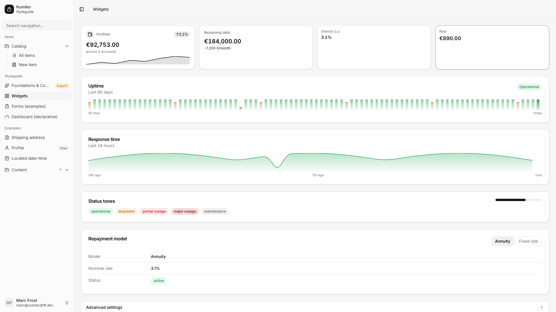
cd samples/apps/styleguide && bun dev # → http://localhost:4180/widgetsThe catalog page composes the widgets directly in a custom screen:
// Visual catalog of the widget kit — every section shows one widget with// static data. Also serves as the e2e render surface (content.spec).
import { useLocale, usePrimitives, useTranslation } from "@cosmicdrift/kumiko-renderer";import {  AiTextArea,  AiTextField,  BooleanField,  CollapsibleSection,  ComparisonTable,  DateField,  DetailList,  Drawer,  EmptyState,  InfinityList,  MiniStat,  ModeSwitch,  MoneyField,  PercentField,  ProgressBar,  RangeField,  ResizableHandle,  ResizablePanel,  ResizablePanelGroup,  ResultPanel,  ResultTable,  SectionCard,  SelectField,  StatCard,  StatusBadge,  StatusBarChart,  TextareaField,  TextField,  TimeseriesChart,  useDraft,} from "@cosmicdrift/kumiko-renderer-web";import { Wallet } from "lucide-react";import { type ReactNode, useEffect, useMemo, useState } from "react";import { euro, percent } from "../lib/format";
const RESPONSE_TIMES = Array.from({ length: 48 }, (_, i) => ({  atMs: i * 30 * 60 * 1000,  value: i === 20 ? null : 120 + Math.round(80 * Math.abs(Math.sin(i / 5))),}));
export function Widgets(): ReactNode {  const t = useTranslation();  const locale = useLocale().locale();  const [mode, setMode] = useState<"annuity" | "fixed">("annuity");  const [drawerOpen, setDrawerOpen] = useState(false);  const [belowHeaderDrawerOpen, setBelowHeaderDrawerOpen] = useState(false);  const { Button } = usePrimitives();
  const uptime = useMemo(    () =>      Array.from({ length: 90 }, (_, i) => ({        key: `day-${i}`,        level: i === 30 ? 0.25 : i % 17 === 0 ? 0.75 : 1,        tone: i === 30 ? ("critical" as const) : i % 17 === 0 ? ("warn" as const) : ("ok" as const),        label: t("widgets:catalog:uptime-day", { n: i + 1 }),      })),    [t],  );
  return (    <div className="flex flex-col gap-6 p-6" data-testid="widgets-page">      <div className="grid gap-4 sm:grid-cols-2 lg:grid-cols-4">        <StatCard          icon={<Wallet className="size-4" aria-hidden="true" />}          label={t("widgets:catalog:portfolio")}          value={euro(92753, locale)}          sub={t("widgets:catalog:portfolio-sub")}          delta={{ value: percent(2.1, locale), direction: "up", tone: "positive" }}          spark={[3, 5, 4, 7, 6, 9, 11, 10]}        />        <StatCard          label={t("widgets:catalog:remaining-debt")}          value={euro(184000, locale)}          tone="warn"          trend={t("widgets:catalog:remaining-debt-trend")}        />        <MiniStat label={t("widgets:catalog:interest-rate")} value={percent(3.1, locale)} />        <MiniStat          label={t("widgets:catalog:rate")}          value={euro(890, locale)}          tone="positive"          emphasize        />      </div>
      <SectionCard        title={t("widgets:catalog:uptime")}        subtitle={t("widgets:catalog:uptime-subtitle")}        action={<StatusBadge tone="ok">{t("widgets:catalog:operational")}</StatusBadge>}      >        <StatusBarChart          ariaLabel={t("widgets:catalog:uptime-aria")}          entries={uptime}          startLabel={t("widgets:catalog:uptime-start")}          endLabel={t("widgets:catalog:uptime-end")}        />      </SectionCard>
      <SectionCard        title={t("widgets:catalog:response-time")}        subtitle={t("widgets:catalog:response-time-subtitle")}      >        <TimeseriesChart          points={RESPONSE_TIMES}          windowStartMs={0}          windowEndMs={24 * 60 * 60 * 1000}          ariaLabel={t("widgets:catalog:response-time-aria")}          axisLabels={{            start: t("widgets:catalog:24h-ago"),            mid: t("widgets:catalog:12h-ago"),            end: t("widgets:catalog:now"),          }}        />      </SectionCard>
      <SectionCard        title={t("widgets:catalog:status-tones")}        action={<ProgressBar value={0.65} className="w-40" />}      >        <div className="flex flex-wrap gap-2">          <StatusBadge tone="ok">{t("widgets:catalog:status-operational")}</StatusBadge>          <StatusBadge tone="warn">{t("widgets:catalog:status-degraded")}</StatusBadge>          <StatusBadge tone="bad">{t("widgets:catalog:status-partial-outage")}</StatusBadge>          <StatusBadge tone="critical">{t("widgets:catalog:status-major-outage")}</StatusBadge>          <StatusBadge tone="muted">{t("widgets:catalog:status-maintenance")}</StatusBadge>        </div>      </SectionCard>
      <SectionCard        title={t("widgets:catalog:repayment-model")}        action={          <ModeSwitch            value={mode}            onChange={setMode}            options={[              { value: "annuity", label: t("widgets:catalog:mode-annuity") },              { value: "fixed", label: t("widgets:catalog:mode-fixed") },            ]}          />        }      >        <DetailList          rows={[            {              label: t("widgets:catalog:model"),              value:                mode === "annuity"                  ? t("widgets:catalog:mode-annuity")                  : t("widgets:catalog:mode-fixed"),            },            { label: t("widgets:catalog:nominal-rate"), value: percent(3.1, locale) },            {              label: t("widgets:catalog:status"),              value: <StatusBadge tone="ok">{t("widgets:catalog:active")}</StatusBadge>,            },          ]}        />      </SectionCard>
      <CollapsibleSection title={t("widgets:catalog:advanced-settings")}>        <EmptyState          title={t("widgets:catalog:no-extra-repayments-title")}          description={t("widgets:catalog:no-extra-repayments-description")}        />      </CollapsibleSection>
      <SectionCard        title={t("widgets:catalog:drawer")}        action={<Button onClick={() => setDrawerOpen(true)}>{t("widgets:catalog:open")}</Button>}      >        <DetailList          rows={[            {              label: t("widgets:catalog:status"),              value: drawerOpen                ? t("widgets:catalog:open-status")                : t("widgets:catalog:closed-status"),            },          ]}        />      </SectionCard>      <Drawer        open={drawerOpen}        onOpenChange={setDrawerOpen}        title={t("widgets:catalog:drawer-message-title")}        description="William Smith · 09:34"        footer={          <>            <Button variant="secondary" onClick={() => setDrawerOpen(false)}>              {t("widgets:catalog:cancel")}            </Button>            <Button onClick={() => setDrawerOpen(false)}>{t("widgets:catalog:save")}</Button>          </>        }        // The footer's Cancel button already closes the drawer, so the        // header X would be a second way to do the same thing.        showCloseButton={false}        testId="drawer-demo"      >        <p className="text-sm">Hi team, just a reminder about our meeting tomorrow at 10 AM.</p>      </Drawer>
      <SectionCard        title="Drawer (below header)"        action={<Button onClick={() => setBelowHeaderDrawerOpen(true)}>Open below header</Button>}      >        <DetailList          rows={[            {              label: t("widgets:catalog:status"),              value: belowHeaderDrawerOpen                ? t("widgets:catalog:open-status")                : t("widgets:catalog:closed-status"),            },          ]}        />      </SectionCard>      <Drawer        open={belowHeaderDrawerOpen}        onOpenChange={setBelowHeaderDrawerOpen}        variant="flush"        belowHeader        title="Docked below the header"        footer={          <Button onClick={() => setBelowHeaderDrawerOpen(false)}>            {t("widgets:catalog:cancel")}          </Button>        }        showCloseButton={false}        testId="drawer-below-header-demo"      >        <p className="text-sm">          Panel top sits at the header's bottom edge, panel bottom sits at the viewport's bottom          edge — this footer button must stay visible.        </p>      </Drawer>
      <InboxDemo />      <FinancingCalculatorDemo />      <FormFieldsDemo />      <ComparisonDemo />      <AiTextDemo />    </div>  );}
type InboxMessage = {  readonly id: string;  readonly sender: string;  readonly subject: string;  readonly snippet: string;  readonly unread: boolean;};type InboxPage = { readonly rows: readonly InboxMessage[]; readonly nextCursor: string | null };
// Inbox-like scroll list: filter (unread toggle + search) + row action// (archive, no-op like the other demo buttons here). Clicking a row shows// the message in the right panel — split via resizable, like the list/read// pair in real mail clients (a draggable handle instead of an OS resize// grip).function InboxDemo(): ReactNode {  const t = useTranslation();  const { Button } = usePrimitives();  const [unreadOnly, setUnreadOnly] = useState(false);  const [search, setSearch] = useState("");  // Debounced: InfinityList refetches whenever its payload identity changes  // (payloadKey = JSON.stringify(payload)), so wiring `search` directly in  // would refetch on every keystroke — a loading flash per character.  const [debouncedSearch, setDebouncedSearch] = useState("");  useEffect(() => {    const id = setTimeout(() => setDebouncedSearch(search), 250);    return () => clearTimeout(id);  }, [search]);  const [selected, setSelected] = useState<InboxMessage | null>(null);  return (    <SectionCard      title={t("widgets:catalog:inbox")}      action={        <div className="flex items-center gap-2">          <ModeSwitch            value={unreadOnly ? "unread" : "all"}            onChange={(v) => setUnreadOnly(v === "unread")}            options={[              { value: "all", label: t("widgets:catalog:filter-all") },              { value: "unread", label: t("widgets:catalog:filter-unread") },            ]}          />          <Button variant="secondary" onClick={() => {}}>            {t("widgets:catalog:mark-all-read")}          </Button>        </div>      }    >      <TextField        label={t("widgets:catalog:search")}        id="inbox-search"        name="inbox-search"        value={search}        onChange={setSearch}        placeholder={t("widgets:catalog:search-placeholder")}      />      <ResizablePanelGroup orientation="horizontal" className="mt-3 h-96 rounded-lg border">        <ResizablePanel defaultSize="35" minSize="25" className="overflow-y-auto">          <InfinityList<InboxPage, InboxMessage>            query="widgets:query:metrics:inbox-messages"            payload={{ unreadOnly, search: debouncedSearch }}            pageSize={6}            rows={(data) => data.rows}            nextCursor={(data) => data.nextCursor}            rowId={(row) => row.id}            testId="inbox-demo"            live={true}            renderRow={(row) => (              <div                className={`flex items-start justify-between gap-4 border-b px-3 py-2 last:border-b-0 hover:bg-muted/50 ${                  selected?.id === row.id ? "bg-muted" : ""                }`}              >                <button                  type="button"                  onClick={() => setSelected(row)}                  className="min-w-0 flex-1 text-left"                >                  <div className={row.unread ? "font-semibold" : ""}>                    {row.sender} · {row.subject}                  </div>                  <div className="truncate text-sm text-muted-foreground">{row.snippet}</div>                </button>                <Button variant="secondary" size="sm" onClick={() => {}}>                  {t("widgets:catalog:archive")}                </Button>              </div>            )}          />        </ResizablePanel>        <ResizableHandle withHandle />        <ResizablePanel defaultSize="65" minSize="30" className="overflow-y-auto p-4">          {selected === null ? (            <EmptyState              title={t("widgets:catalog:no-message-selected-title")}              description={t("widgets:catalog:no-message-selected-description")}            />          ) : (            <div>              <div className="font-semibold">{selected.sender}</div>              <div className="text-sm text-muted-foreground">{selected.subject}</div>              <p className="mt-4 text-sm">{selected.snippet}</p>            </div>          )}        </ResizablePanel>      </ResizablePanelGroup>    </SectionCard>  );}
// Ghost-text completion + correct/translate/rewrite toolbar. The server// handler here is a hand-rolled demo feature (ai-text-demo.ts, canned// strings), not the real enterprise feature — kumiko-framework must not// import kumiko-enterprise. The title field is deliberately pre-filled with// a value wider than the box (ghost-overlay scroll sync), the note textarea// with more lines than visible (vertical scroll sync).function AiTextDemo(): ReactNode {  const t = useTranslation();  const [title, setTitle] = useState(() => t("widgets:catalog:long-title-demo"));  const [note, setNote] = useState(() =>    Array.from({ length: 12 }, (_, i) => t("widgets:catalog:long-note-line", { n: i + 1 })).join(      "\n",    ),  );  return (    <SectionCard      title={t("widgets:catalog:ai-text")}      subtitle={t("widgets:catalog:ai-text-subtitle")}    >      <AiTextField        id="ai-text-title"        name="title"        label={t("widgets:catalog:title")}        value={title}        onChange={setTitle}      />      <AiTextArea        id="ai-text-note"        name="note"        label={t("widgets:catalog:note")}        value={note}        onChange={setNote}        rows={4}      />    </SectionCard>  );}
// Field widgets for non-number types (select/date/text/boolean/textarea) —// wrap the same usePrimitives input kinds as NumberField.interface FieldsDraft {  readonly land: string;  readonly datum: string;  readonly name: string;  readonly aktiv: boolean;  readonly notiz: string;  readonly abruf: number;}
const FIELDS_DEFAULTS: FieldsDraft = {  land: "NW",  datum: "2026-07-10",  name: "",  aktiv: true,  notiz: "",  abruf: 40,};
function FormFieldsDemo(): ReactNode {  const t = useTranslation();  const { draft, field } = useDraft<FieldsDraft>(FIELDS_DEFAULTS);  const { Button } = usePrimitives();  return (    <SectionCard title={t("widgets:catalog:form-fields")}>      <TextField        label={t("widgets:catalog:name")}        {...field("name")}        placeholder={t("widgets:catalog:name-placeholder")}      />      <SelectField        label={t("widgets:catalog:state")}        {...field("land")}        options={[          { value: "NW", label: t("widgets:catalog:state-nw") },          { value: "BY", label: t("widgets:catalog:state-by") },        ]}      />      <DateField label={t("widgets:catalog:date")} {...field("datum")} />      <BooleanField label={t("widgets:catalog:include-broker")} {...field("aktiv")} />      <RangeField        label={t("widgets:catalog:call-rate", { n: draft.abruf })}        {...field("abruf")}        min={0}        max={100}        step={5}      />      <TextareaField label={t("widgets:catalog:note")} {...field("notiz")} rows={3} />      <div className="flex items-center gap-2">        <Button size="sm" variant="secondary" onClick={() => {}}>          {t("widgets:catalog:small")}        </Button>        <Button onClick={() => {}}>{t("widgets:catalog:standard")}</Button>      </div>    </SectionCard>  );}
// Transposed comparison (row = metric, column = variant), best value// highlighted — for scenario/offer comparisons.function ComparisonDemo(): ReactNode {  const t = useTranslation();  const locale = useLocale().locale();  const scenarios = [    { name: "A", rate: 890, interest: 84000 },    { name: "B", rate: 940, interest: 71000 },  ];  const minIndex = (pick: (s: (typeof scenarios)[number]) => number): number => {    let bestI = 0;    let bestV = Number.POSITIVE_INFINITY;    scenarios.forEach((s, i) => {      const v = pick(s);      if (v < bestV) {        bestV = v;        bestI = i;      }    });    return bestI;  };  return (    <SectionCard title={t("widgets:catalog:comparison")}>      <ComparisonTable        columns={scenarios}        columnHeader={(s) => s.name}        columnKey={(s) => s.name}        metricLabel={t("widgets:catalog:metric")}        metrics={[          {            label: t("widgets:catalog:monthly-rate"),            value: (s) => euro(s.rate, locale),            bestIndex: () => minIndex((s) => s.rate),          },          {            label: t("widgets:catalog:total-interest"),            value: (s) => euro(s.interest, locale),            bestIndex: () => minIndex((s) => s.interest),          },        ]}      />    </SectionCard>  );}
// Live-input calculator: useDraft → pure calculation → ResultPanel/ResultTable.// Shows the form kit carries the apps' calculator pattern without custom CSS.interface CalcDraft {  readonly sum: number | undefined;  readonly interest: number | undefined;  readonly repayment: number | undefined;}
const CALC_DEFAULTS: CalcDraft = { sum: 300000, interest: 3.8, repayment: 2 };
function FinancingCalculatorDemo(): ReactNode {  const t = useTranslation();  const locale = useLocale().locale();  const { draft, field } = useDraft<CalcDraft>(CALC_DEFAULTS);  const ready = draft.sum !== undefined && draft.interest !== undefined;  const rate = ready    ? Math.round((draft.sum * ((draft.interest + (draft.repayment ?? 0)) / 100)) / 12)    : 0;  return (    <div className="grid gap-4 lg:grid-cols-2">      <SectionCard title={t("widgets:catalog:financing")}>        <MoneyField label={t("widgets:catalog:loan")} {...field("sum")} required />        <PercentField label={t("widgets:catalog:nominal-rate")} {...field("interest")} required />        <PercentField label={t("widgets:catalog:repayment")} {...field("repayment")} />      </SectionCard>      <ResultPanel        title={t("widgets:catalog:result")}        empty={!ready}        emptyText={t("widgets:catalog:enter-loan-and-interest")}        rows={[          { label: t("widgets:catalog:loan"), value: euro(draft.sum ?? 0, locale) },          { label: t("widgets:catalog:monthly-rate"), value: euro(rate, locale), emphasize: true },        ]}      >        <ResultTable          columns={[            {              header: t("widgets:catalog:tranche"),              cell: (r: { label: string; rate: number }) => r.label,            },            {              header: t("widgets:catalog:rate"),              align: "right",              cell: (r) => euro(r.rate, locale),            },          ]}          rows={[{ label: t("widgets:catalog:bank-loan"), rate }]}          rowKey={(r) => r.label}        />      </ResultPanel>    </div>  );}
See also
Section titled “See also”- Dialog and Lightbox overlays, the overlay primitives the widget kit does not cover.
- Build a marketing landing page : the same widgets on an apex page.
- Styleguide sample, the runnable app behind the catalog above.